GiS – The Unsung Hero of Crisis Mapping
And how ordinary people do extraordinary things.
Anyone who knows me, knows I have a singular gift at getting lost. So I love maps. And, hate them too … It’s a complicated relationship. At the heart of this affair is the blithe assumption that the entire world is mapped, that there isn’t a place on this planet left unchartered: after all, the first satellite images the earth were taken on the sub-orbit V2 flight in October 1946 – more than 70 years ago. So if we know anything in detail, surely it’s the surface of the earth.
It turns out that assumption isn’t entirely true, and it isn’t exactly true because how we plot co-ordinates and draw up a map of land, is an entirely a different thing to how we represent information about that place, like drawing on another layer of streets. That extra layer is geographic information, and in our digital world, we potentially hold a lot of information about places, and this data is gathered in GiS.
So here in London there’s a lot of demand and reliance on geographic information: detailed street maps, ordnance surveys, councils have databases of all the locations of their streetlanos
It certainly surprised me that there are vast areas of the world that are not properly mapped, areas that have no streets plotted out; areas that in a crisis would be difficult to get relief aid to. And this shocked me, and got me thinking about maps as something other than a depiction of place. Geographic information systems can be a powerful strategic tool to create visual representations of everything from how Local Authorities can better manage public services all the way through to proving that it’s no longer six degrees of separation that connects us all, but (thanks to social media) four degrees.
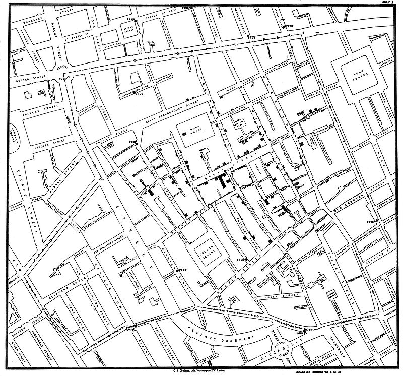
Perhaps one of the most inspiring stories of how a humble map revolutionised medicine, and our ability to react to a crisis, starts with a doctor, John Snow, back in Victorian London and tells of his one-man crusade to prove Cholera wasn’t an airborne virus.
Snow used a map in 1862 to overturn the school of though pervading the medical profession at the time – Miasma Theory, that was widely accepted to be the cause of Cholera.
To appreciate the struggle he contended with to achieve this, its worth remembering that in 1854, London was the largest city ever built and home to around 2.5 million people. A densely populated city with no running water or sewage drains – the Victorians were trying, simulataneously to live through – and invent – the scale of living we now call Metropolitan.
That’s 2.5 million people who daily disposed of their raw sewage by tossing it into their basements, creating 3ft deep cesspools. A city where millions of people kept livestock from chicken to cows in their attics, a lively metropolis connected together by horse-drawn carts and carriages. It would have been a city shrouded in an unimaginable stench; and it would have been perfectly reasonable at the time to assume the heavily polluted air was the culprit in carrying the disease around the city; killing off tens of thousands of people at a time.
Snow thought differently. He didn’t believe Cholera was airborne, but was in fact being spread in the water. Unfortunately, he was one single voice speaking out against the entrenched wisdom of his profession, and despite arguing for years with anyone who would listen, he convinced exactly no one of his theory, and was basically ignored by everyone.
So when people started to contract the virus close to where he lived in Soho, Snow started mapping cases of cholera around a water fountain in Broad Street, widely thought to have the best water in London, and – as it later turned out – also ground zero for one of the most terrifying cholera outbreaks in that time. By documenting the cases he diagnosed and try to treat on a map, Snow created a visual representation of how the outbreak spread out from water fountain, and was slowly able to shift the accepted understanding of the time, and prove that the disease was spread in water – ultimately saving thousands of lives.
Moving on in time and space to January 12, 2010 – Haiti.
On a mostly insignificant Tuesday afternoon in Port-au-Prince, sometime just before 5pm, a force 7 earthquake shook the entire city and brought it crashing down to the ground, killing hundreds of thousands and displacing millions. A tragic natural disaster, from which the country is still trying to recover, is also a stunning example of how maps aren’t all equal, and, how citizens – just ordinary people – pulled together across the globe to try and help, filling the gap left by the government in responding to crisis – and they did this by plotting information on to a map.
Patrick Meir – at the time, a student on mid-term break in North America, saw the disaster reported on the news and, desperate to offer some help, he started picking up real time tweets and social network posts from people using cell phones in Port-au-Prince, and plotting these on a map; adding in pictures and videos where available. In doing this, he essentially started to enrich the basic map of Port-au-Prince with layers of geographic information that made it the most compressive and up-to-date map available to the humanitarian community in Haiti, who were working to deliver aid and relieve the crisis, in a city that had lost its basic infrastructure and was spiralling out of control. He didn’t do this alone. Using social media, he recruited and coordinated a stunning joint effort of volunteers across the globe, using open source platforms and resourceful means to keep the map updated with relevant information, supporting the Crisis Aid operations in their day-to-day response to the immediate aftermath of the disaster.
The incredible thing about this story is the force of human nature, the capacity of ordinary people with other responsibilities, and without special training to reach out and respond to those in crisis with jaw dropping efficiency. Meir co-ordinated a global effort from volunteers around the world who spoke different languages and were based in different timezones to achieve a coordinated and useful response to a crisis in a country he wasn’t even a citizen of.
As our world gets more interconnected and our need – and expectation – of public services more complicated and intricate, framed as it currently is, within growing sociopolitical tensions, there’s a vast potential to use GiS to transform the way we deliver public services, drive healthcare decisioning and represent data geographically to learn new things about ourselves – and, hopefully, plot a route forward that leaves no one behind.